Any brand would not be successful if it did not have any recall whatsoever from its target market which is why it’s really very important to create a strong and effective brand and look for ways to improve brand recall online and offline.
This first section of the graphic design and branding series will talk about using graphic design and how we can optimize graphics to increase the effectiveness of your brand.
When we say “brand“, we are not limited to physical products but it may also include personalities or even blogs. We can also look at our blogs as brands. So for this series, let’s think of “brands” as something we wish to promote and eventually earn from. And in this sense, even you can be a brand!
The foundation of an effective brand lies in the visual appeal it creates from the beginning of a campaign. Oh but don’t worry if you have already created your brand and you suddenly feel it is not suitable for your image or product, know that it’s never too late for improvement!
Here are a couple of areas where you can put your creative juices to work to improve brand recall:
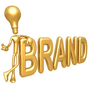
#1 Creative logo design
The logo is the personality you create for your brand and it projects the brand image you want your consumers to remember. By using an appropriate graphic with a well-coordinated color scheme and a font that reflects your brand, you can trust your creative logo design to carry the image you have set for your brand. Remember, you are going to use your logo EVERYWHERE so make sure it’s really eye-candy yet simple!
#2 Buttons or blinkies that promote your site
One of the best ways to promote your brand is to use a button or a blinkie. It can be in a static form such as a button or a blinkie which literally means that it is blinking. What’s nice about this graphic element is that it can be coded to link to your site or shop and you can actually swap it with other bloggers and websites to increase your traffic. With a regular size of 150 x 150 pixels, you can use them as small ads for your brand.

#3 Visual email campaign
People receive numerous emails each day and so it’s really important to make your email blast stand out. By using a visually stimulating email blast design, you can create a campaign that your target customers can remember. Make sure though, to consider the size of the email design you have chosen so it will have faster download time and will make your email message more engaging rather than time-consuming.
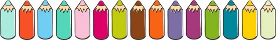
#4 Using colors that stick
The colors you use play an important role in creating brand recall so make it a point to use well-coordinated colors that match your brand image and style. Remember that your colors should create brand familiarity.
These are just some of the areas where you can dabble in graphic design, there are many other areas such as websites, ads and others. Just be creative and remember to use elements that stick! I’ll see you again next Saturday for an awesome post on logo design and tips (that even top graphic designers use!) on how you can create your own logo!
 I’m Issa and I am a firm believer of using creativity in our everyday lives. A freelance graphic designer, an entreprenuer and a budding vegetarian cook are just few of the things that I am. As I continuously cultivate my inner child, I discover a zest for creating and making things such as crafts and other digital products like party invitations.
Join me at Issa Sarza: Creative Living and catch great creative freebies and ideas on how to live an inspiring and artistic life!

Graphic design is usually a concept and art that practically every business owner is carrying out for the development in their business.
Glad you guys liked the post 🙂 thank you!
I loved the color pencils. I never thought to put then together like this.
Thank you so much.
I would like to receive the purple birthday girl milk carton favor box.
Thanks a lot!!
Thanks about the “Color” pencils – that in itself as you have lined them up is a great idea – gives you a visual on how the colors match and blend – great idea – never thought about it – even crayons – in the advert along the side bar – is usable – color side by side is a great visual.
Nice way to present it, thanks – Toby
This is great info. Thanks. Cant wait until next weeks logo design post.