Using the right combination of fonts in your design is key in achieving a custom finished product.
There are a few rules of thumb to follow when using type. Although I occasionally use a wide rang of typeface designs on certain projects, you should generally use no more than three fonts on a single design. Then, the question arises, “well, what fonts should I use?” And, “how do I mix them together, yet make them look unified and cohesive?” Before we get into that, let’s delve into a brief anatomy lesson.

A serif typeface is a font that has little structural details at the end of each stroke, as seen in the fonts listed above.
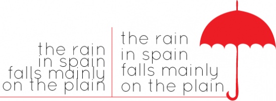
A sans serif, is a font that is free of those structural details. I personally, happen to be addicted to sans serif fonts. They always look clean and simple to me.
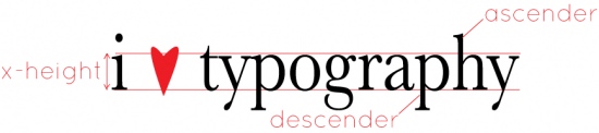
Then you have ascenders and descenders. The ascender is the part of a lower-case letter that is taller than the font’s x-height. And, in contrast, the descender is the part of the lower-case letter that extends below the baseline. Together, ascenders and descenders help the eye recognize words. You also need to be cautious when using type, that the ascenders and descenders are not too close between lines, as show below.
Now for the fun part. Mixin’ it up! If you’re a typeface junkie like me, you will love these online resources for free fonts. The more fonts the merrier, if you ask me. Sewers always talk about fabric they had in their “stash,” but designers have a stash, too… our computer’s fontbook. Nothing gets me more excited than finding a new, unique font, and adding it to my fontbook.
Some of my favorite places to peruse fonts are:


Everyone’s taste in fonts and design are different. Comic sans is one of my least favorite fonts, but my mom loves it. So, to each their own! Find a typeface that speaks to you and is going to be a positive addition to your design.
When mixing fonts, be cautious. If you are using one font that especially wacky or fancy, mix it with another font that is light and simple.
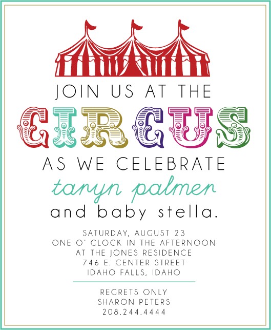
In the baby shower invitation above, you will find three fonts. There is a big bold ornamental font, accompanied by two simpler fonts that are similar in stroke size. By stroke size, I mean the width of the line. If I would have paired the ornamental font with a bold font and a super scripty font, it would not have a the same simplistic cleanness. It would start looking overworked and busy.
The best tool in working with type is simply practice and research. Look through magazines and find adds or story headers that catch your eye. Look at what kind of fonts they used. Did they use a serif or a sans serif? How many fonts did they use in their design? What color scheme did they use? Put your inspiration to use and practice working with type. You might have a knack for it and surprise even yourself!
Check us out next week as we delve into the use of color in design and teach you to harness the rainbow!
 Hey there Tip Junkies! My name is Emily and I am so excited to team up with my fellow sissies from Sissyprint and share some of our design secrets with you! We’re really opening up our bags of tricks, so stay tuned through the month of October and get in on the nitty-gritty on how to become more graphic design savvy.
Part of what makes designing fun for us, is making that certain project look custom and personalized. And the best part? You don’t have to be a professional graphic designer to achieve that customized look!

P.S. I added a space in my tweet (see below)
Thanks for great info!
Just a FYI: when you hit “tweet this” the via@ needs a space so you can properly be attributed!
I think another great idea resource for font pairing ideas is to look at all of the wedding invitations that are going out now. There are so many fresh clean designs being sent out, and it is worth it to save the ones that catch your eye. Due to my dad’s standing is his job and community, he receives a lot of invites. When I see one that catches my eye, whether for the photography or the font use, I ask him to save it and give it to me.
I am a complete typeface junkie so this is a great and helpful read. I found a new font source (font squirrel) Uh-Oh! Thanks 🙂