Over the past two Saturday’s Emily, a fellow sissy from Sissy Print has taught you about making clipart look custom and using typography the right way . Today, we get to continue this series and look a little deeper into design as we discuss color and all of the fabulous options in finding inspiration through it.
There are literally thousands of colors at a designers disposal and just as many ways of combining them, but finding those perfect colors to make a project POP is what every designer should be looking for. When choosing a color scheme for any project, you need to remember something very important about color; some of them look good together and some don’t. Easy enough right? Wrong…
What we should be aiming for are harmonious color combos. We don’t want a color scheme that makes you feel like throwing up as soon as you look at it because your head starts to spin. That is where complementary colors come into play.
You’ve all heard of the color wheel. Well, complementary colors are those colors across from one another on the color wheel. (In this case diagonal). By using colors on a project that complement each other, you create a more vibrant, vivid end result. Some examples of complementary colors include orange and blue or green and red.
If your design calls for a more soothing feel, choose colors that are still complementary, but closer to one another on the color wheel.
This information isn’t only important for making a design cohesive, it is also vital for the legibility of the design. Legibility refers to how clearly something can be read. Although there are certain projects where designers intentionally break the rules of legibility to create a certain mood or make a certain point, the majority of us want our designs to be easy to read and easy to understand.
Contrast is the key to creating legible design, this means, get to know the color wheel! Make it your friend and run with it!!
{Sherwin Williams has an awesome Color Theory page if you are still having trouble understanding the color basics.}
Now that we understand the importance of choosing color to make a cohesive, legible design, we get to have fun with it. Where do you find your color palette inspiration? Obviously with each design you don’t want to stick to the boring yellow and violet and red and green color schemes. That is where the great wide world of the internet can become your best friend! There are millions of places you can go to find great ideas on mixing color. Some of the places that I find my wild color combinations are places like:
 (click on each logo to go directly to the site)
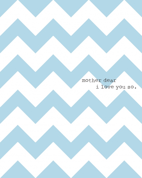
Color inspiration for design can come from anything and everything. Paint colors, flower arrangements, furniture, fabric, and even nature are where I find a lot of my inspiration. Take a look at this simple mother’s day print I made for my own mom. Her room is a cool, soothing haven, so I wanted the print to match that feeling. And so, a light blue and white color combination was the perfect blend.
When designing, always keep in mind who or what you are designing a project for. Take a look at this Breast Cancer Awareness poster from one of my favorite design blogs Memento Designs.
She understood her client and incorporated pink into her design in a meaningful way. This is a perfect example of using color in a way that is conducive to who and what the design is for. Not only did she use a color with significance for the cause, she made sure that the poster was legible. The colors used throughout her design are easy to read and easy to understand.
The best way to feel comfortable with combining colors is to practice. Start with two colors and then work your way through the different hues of those colors to create a masterpiece! Color is one of the best ways to liven up a design. Start with what you know, and then break the rules a little and have some fun! There is inspiration all around us, we just have to look.
 Hello you amazing Tip Junkies! My name is Kyrsten and I along with my fellow Sissies over at Sissy Print are having a blast sharing our design know how with all of you! This month we have showed you how to make clipart look custom and how to use typography the right way! Don’t forget to stick around next week when Addie teaches you how to go beyond the keyboard with your design. It’s going to be amazing!!!


The information is nicely presented in post, I am happy to find many useful facts, Thanks for sharing.